Software companies that take the time to understand Information Architecture generate revenues up to seven percent higher than those that don’t. It is critical to know how the parts relate to the whole.
Imagine two internet browsers. In terms of what they deliver, both browsers provide the same end-product—both access the same internet at roughly the same speed. The only way the browsers differ (and thus, the only way for the browsers to compete), is based on how users can navigate using the browser, find and save information, and customize the browser to their individual preferences. In short, the information architecture of the browsers represents a strategic differentiator.
Information architecture isn't just a structure that's reflected in a product. Instead, it can represent any information system's structural design, from an application to an entire sales organization. Within a product context, information architecture is the combination of organization, labels, and navigation subsystems that support a product's usability and find-ability. The conceptual framework of information, the context, a user's awareness of location within the system, and a resilient structure all contribute to the information architecture.
Information architecture has been with us for as long as there has been both information and a debate about how it should be stored. With that said, the term itself, and the field as an organized discipline, has only been around since about 1975, when it was coined by the architect Richard Saul Wurman. Given that the formalized profession of "information architect" is exceptionally new, how is it that user experience (UX) design has become such an important part of product design?
Part of the reason is that products themselves have become more complicated. Surveys show that 92% of product designers have seen their output become more complicated over the last five years. Companies are either racing to outdo each other in terms of the appealing technological marvels they can provide (witness the rise of the foldable smartphone, for example), or they're creating increasingly diverse product lines to satisfy increasingly fragmented customer preferences.
And, consumers like it - they like technological wizardry, and they like personalization—but they want to use their complex and heavily personalized purchases instinctually, without overthinking. If the UX design fails, customers will find the product impenetrable (best case scenario) or misuse it by accident.
To expand on an example, one of the first foldable smartphones failed because customers removed what they thought was a protective film, only to find that they'd broken a critical component of the screen. One of the first things you do with a new phone is to remove the packaging, but taking this instinctual action caused users to ruin their new purchase before they even got the chance to use it—and there was no way they could have known not to do this. It's a textbook case of bad UX design.
Good UX design promises the reverse. No matter how complex you happen to make your design, good information architecture will allow your users to access its best features organically, providing a satisfying user experience even if your customers don't read the manual.
A lot of information architecture tends to happen by accident—that is, it's not planned, and it's a happy accident if it turns out well. If you haven't done it before, how do you get started creating good information architecture—and thus a good user experience—in an intentional manner?
One way to get started is by using what's known as a DoGo map. Traditional structures for creating information architecture, such as flow charts and site maps, are sufficient for more static applications, but here we're assuming an iterative working environment where the final output can swing dramatically from the original plan.
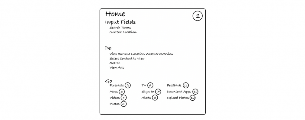
Your DoGo map can start with something as simple as a post-it note (shown below).
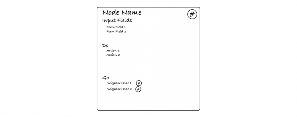
Each node represents a page within your application or website. Input fields represent the things you can manipulate with regard to a feature. The "Do" term represents what a consumer can do with regards to the input fields. "Go" says which node a user can go to next. Each node gets a number (mostly for easy reference) displayed in the upper right of the note.
Lastly, there's Card Zero, or "common," which captures information that should appear on every node within the application or site.
Once you've assembled your initial collection of post-it note cards, one for each page in the application, which once again may change throughout the design process, you can begin arranging them on a map. Each card should have a line connecting it to the other cards representing its "Go" section.
As a result of this information architecture process, you will end up with a flexible map of your application that gives customers all the information they need to use the application instinctually—without spending a lot of time looking up how to use it or getting bogged down in blind alleyways. No matter how customers choose to use your application, and no matter how complicated it becomes, customers will be able to pick it up and go.
Our partner, POMIET, specializes in helping companies optimize their information architecture in ways that will create more productive users and more satisfied customers. It's worth noting that companies who succeed at this generate revenues up to seven percent higher than those that don't. If you'd like more information on how to out-compete your industry by creating better user experiences, contact us or POMIET directly.
© 2026 Harmonics Way